10 Lesser Known Hipgnosis Masterpieces
Hipgnosis created some of music's most iconic album covers in the 1970s. You know their famous work: Led Zeppelin's "Houses of the Holy", Pink Floyd's "Animals", and Peter Gabriel's "Melt". These covers are legendary, and rightfully so.
But here's the thing. Hipgnosis designed hundreds of albums, and many of their best work flies under the radar. You might own these records without realising the same creative minds behind "Dark Side of the Moon" also created them.
I discovered this while waiting for the new film Squaring the Circle (The Story of Hipgnosis) to reach Australian cinemas. There's also Vinyl . Album . Cover . Art: The Complete Hipgnosis Catalogue, which serious collectors apparently need to own. Both got me digging deeper into their lesser-known masterpieces.
Quick Hipgnosis Background
Storm Thorgerson and Aubrey Powell started Hipgnosis in London during the 1960s. Their breakthrough came with Pink Floyd's "A Saucerful of Secrets" in 1968. From there, they created surreal, thought-provoking imagery that changed how people thought about album art.
They worked with everyone from Genesis to Yes to Led Zeppelin, using experimental photography and wild concepts. The collective disbanded in 1983, but their influence continues today. Museums still exhibit their work, and designers still study their techniques.
Source Hipgnosis on Wikipedia and an AI bot who shall remain nameless (they know who they are).
10 Great Covers You Might Not Recognise
This isn't about their most famous work. You already know "Wish You Were Here" and "Dark Side of the Moon". Instead, here are ten brilliant Hipgnosis covers that deserve more recognition. This list is completely subjective, so if you disagree, make your own list. I still think you're great, even if you're wrong.
Peter Gabriel's second self-titled album trades Genesis's theatrical grandeur for something darker and more tactile. Robert Fripp's jagged guitars and Tony Levin's fretless bass create an atmosphere of controlled unease, whilst Gabriel's voice navigates between vulnerability and menace.
The production, pointing towards the gated reverb experiments that would define his eighties work, makes even the poppier moments like D.I.Y. feel slightly unsettled. It's art rock that doesn't announce itself, preferring to burrow under the skin rather than overwhelm from the stage.
This cover gets under your skin because it's genuinely vulnerable. Hipgnosis turns Gabriel's creative turmoil into something you can feel, matching his introspective music perfectly. The tactile, experimental approach proves album art doesn't need glamour to work. It's a masterclass in emotional resonance that most artists would be too scared to attempt. Sometimes the most powerful imagery comes from showing weakness, not strength.
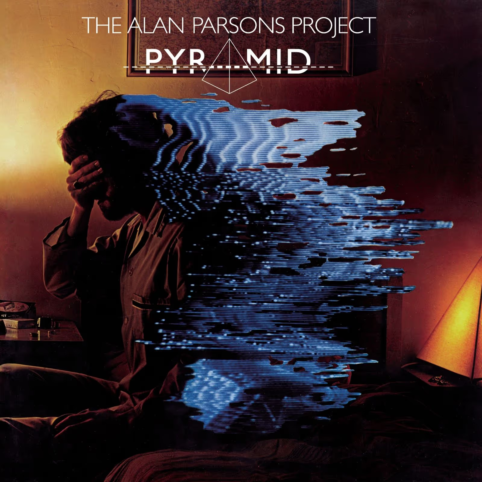
The Alan Parsons Project's third concept album trades sci-fi speculation for ancient Egyptian mysticism, though the sonic architecture remains pristine. What Goes Up became their biggest American hit, its synth-pop hooks wrapped in Parsons' obsessively detailed production, all those Abbey Road tricks applied to prog-rock structures palatable enough for FM radio.
The pyramids might be monuments to the dead, but this 1978 album lives in that sweet spot where art-rock ambition meets commercial pragmatism, Woolfson's melodies smoothing the conceptual edges into something genuinely listenable.
Hipgnosis tapped into the era's mystery obsession brilliantly here. You get conceptual richness without pretentious complexity, which is harder to achieve than it looks. The minimalist approach actually amplifies curiosity rather than satisfying it immediately. It bridges music and visual philosophy in ways that feel natural, not forced. This proves you can be intellectually engaging without being boring, something many progressive rock covers struggle with.
Force It catches UFO mid-transformation, Michael Schenker's second album with the band cementing his melodic precision as their secret weapon. Producer Leo Lyons captured a heavier, more confident sound at AIR Studios, with Shoot Shoot and the sprawling Mother Mary showcasing the German guitarist's ability to balance technical flash with emotional heft.
Phil Mogg's bruised vocals anchor tracks like Let It Roll and High Flyer, while the rhythm section locks into grooves that would influence the New Wave of British Heavy Metal. A transitional record that pointed towards their commercial peak.
This cover hits different because Hipgnosis refuses to play it safe. You get provocative imagery that makes you uncomfortable in the best way possible. They blend industrial elements with intimate moments, creating lasting conversation about boundaries and social norms. It's not just shock value though. The calculated ambiguity keeps you thinking long after you've looked away, which frankly most album covers fail to do.
Ritchie Blackmore's pivot to AOR slickness arrives with Joe Lynn Turner's radio-ready vocals replacing Graham Bonnet's grit, a calculated gambit that delivered I Surrender to UK number three while alienating purists. Roger Glover's polished production frames Blackmore's Beethoven fixation on the title track's Ode to Joy adaptation, hard rock meeting conservatory with typical pomp.
The formula worked commercially, cracking the UK top three, but the shift from Deep Purple's dense muscularity to something approximating Journey upset the faithful even as it filled arenas.
Hipgnosis nailed the irony here. Instead of typical rock drama, you get clinical detachment that's genuinely unsettling. The repetition and anonymity make you question authority and conformity in ways most bands wouldn't dare attempt. It transforms a standard album commission into social commentary. Honestly, it's refreshing when artists use their platform to make you think rather than just sell records.
Look Hear? finds 10cc pared down to Eric Stewart and Graham Gouldman, their Strawberry Studios facility churning out competent pop-rock that lacks the mischievous invention of their Godley and Creme years. The 1980 release peaked at number 35 in Britain, its modest chart showing reflecting both the duo's diminished ambitions and new wave's ascendancy.
One-Two-Five scraped the UK top 30, but the album's workmanlike professionalism couldn't mask what was missing: the experimental spark that once made this band's art-pop genuinely unpredictable.
This one messes with your head in the smartest way. Hipgnosis creates immediate dislocation between reality and fantasy, which perfectly matches 10cc's clever musical approach. The deliberately tiny scale shows their cheeky audacity and complete disregard for traditional marketing. You're forced to question what makes sense, and that's exactly the point. Art should challenge your perception, not just decorate your shelf.
High 'N' Dry catches Def Leppard mid-transformation, Robert John "Mutt" Lange scrubbing the grime off their NWOBHM origins and buffing them into something American radio could stomach. The guitars still crunch on Let It Go, but Bringin' On the Heartbreak revealed the blueprint: power ballads with stadium-sized choruses that MTV would canonise.
What seemed like commercial compromise in 1981 became prophecy once Pyromania made them superstars. Lange's obsessive layering turned Sheffield scruffs into architects of Eighties arena rock, proving accessibility and heaviness weren't mutually exclusive.
The technical skill here is undeniable, but what really works is the narrative tension. Hipgnosis repurposed an earlier concept and somehow made it more compelling than most original ideas. You feel the suspense immediately, which perfectly amplifies the album's energy. It's become genuinely iconic in rock history, and rightfully so. Sometimes taking risks with dramatic imagery pays off better than playing it safe.
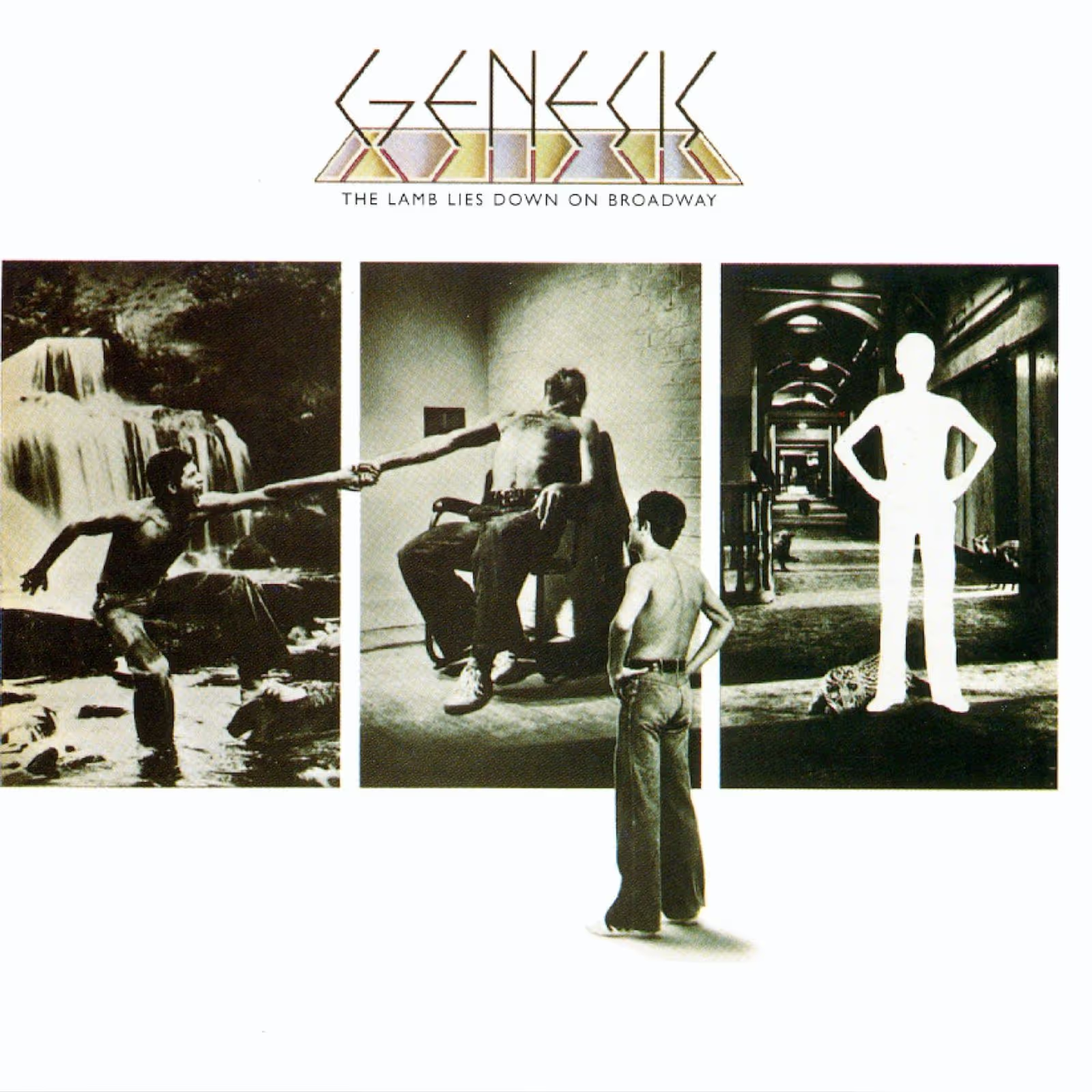
Peter Gabriel's farewell to Genesis plays like a fever dream scrawled on subway walls, 23 tracks chronicling Puerto Rican street kid Rael's hallucinogenic odyssey through identity and myth. Gabriel seized total lyrical control, fracturing the band's collaborative spirit while pushing their theatrical ambitions to breaking point.
The Carpet Crawlers and In the Cage balance prog's grandiosity with genuine emotional weight, though the narrative's opacity frustrated critics in 1974. Time has been kinder: this double album now stands as progressive rock's most audaciously unhinged concept statement, all costume changes and Freudian symbolism.
This breaks every album cover rule and somehow works perfectly. Hipgnosis matches the album's complex storyline with equally complex visuals that refuse to give easy answers. The cinematic approach using montage and abstraction makes you work for understanding, which honestly makes it more rewarding. Most bands would simplify for mass appeal, but Genesis and Hipgnosis trusted their audience's intelligence. That confidence shows in every frame.
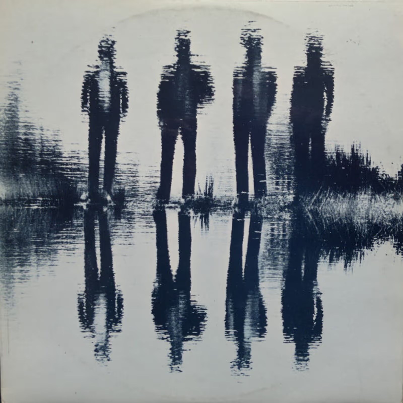
Released as The Nice scattered to the winds, this 1971 compilation captured Keith Emerson's pre-ELP pyrotechnics in their finest classical-rock bastardisations. Mercury Records knew what they had: a catalogue of baroque ambition and Hammond organ assault that suddenly looked prescient once Emerson's new supergroup conquered stadiums.
The tracks span the group's brief, combustible career, showcasing how three musicians could transform Tchaikovsky and Sibelius into something genuinely threatening. It's prog rock's Rosetta Stone, proving virtuosity needn't mean politeness.
Simple forms becoming psychological landscapes? Genius. Hipgnosis proves you don't need complexity to create lasting impact. The symmetry and abstraction resist easy interpretation, which keeps you engaged longer than typical album art. It moves beyond promotional material into genuine artistic exploration. This approach influenced countless progressive rock covers, though few achieved this level of meditative power through such minimal means.
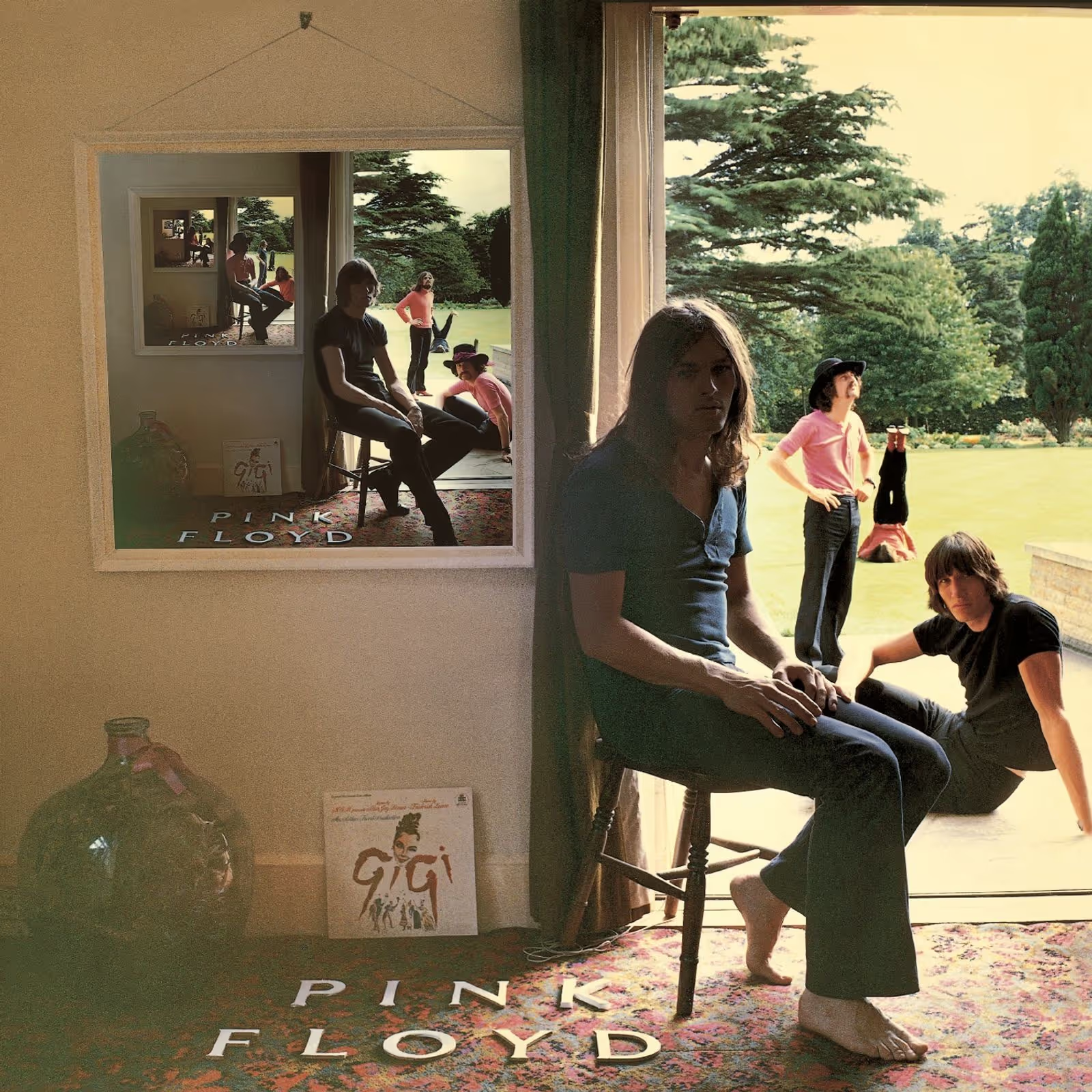
Ummagumma splits Pink Floyd into two contradictory impulses: one disc captures their volcanic live sprawl at peak intensity, stretching Barrett-era psychedelia into vast improvisational terrain. The other grants each member solo space, yielding results from pastoral folk to concrete collages of Scottish gibberish.
It's simultaneously their most generous and scattered statement, a double album that documents both their concert power and what happens when democratic ideals meet experimental indulgence. The live performances endure; the studio experiments remain fascinatingly uneven, marking the restless transition between acid-rock and progressive ambition.
The recursive photography here still messes with your perception decades later. Hipgnosis understood that experimental music deserved equally experimental visuals, creating endless possibility through clever staging. It's become a touchstone of album art history for good reason. The technical rigor combined with intellectual challenge ensures it remains relevant. Most covers age poorly, but this one keeps revealing new details every time you look.
The Aynsley Dunbar Retaliation arrived as British blues hardened its arteries in 1968, with the titular drummer's ferocious technique propelling Victor Brox's sandpaper vocals through originals and standards alike. Fresh from stints with Mayall and Beck, Dunbar wielded jazz chops in service of muscular blues-rock, carving space between purist reverence and the proto-metal rumble to come.
The quartet never troubled the charts, but this debut captured the moment when British blues stopped genuflecting to Chicago and started flexing its own considerable muscle, presaging Dunbar's journey through Zappa, Bowie and Journey's arenas.
This early work shows Hipgnosis understood powerful design from day one. The atmospheric minimalism proves you don't need obvious iconography to create emotional impact. Shadow and composition do all the heavy lifting here, establishing their concept-driven approach that would influence decades of album art. It's remarkable how much mood they achieved with such restraint. Sometimes less really is more, despite what flashier covers might suggest.
"Director Anton Corbijn's first documentary, Squaring the Circle (The Story of Hipgnosis), is a fascinating and suitably maverick snapshot of a richly creative moment in music history, told through a couple of disreputable hippies who designed some of the most iconic album covers of all time" ~ The Guardian
For more detailed stories about the making of these album covers, I highly recommend checking out the following articles:
- Hipgnosis’ Life in 15 Album Covers: Pink Floyd, Led Zeppelin and More by Rolling Stone
- How the most iconic album art of the 70s was made on a shoestring budget by Huck Magazine
- Top 20 album covers by celebrated design group Hipgnosis by Goldmine Magazine
Related articles
Why We Collect Records: The Psychology Behind Your Growing Vinyl Collection

10 Best Music Documentaries Ever Made


